Resume Builder Re-design
The Project
Deliverables
5 Usertesting sessions
Working Prototype
Wireframes
Interaction Specifications Doc.
My Role
UX Designer
Interaction Designer
Timeline
10 Weeks
GOALS
Develop an engaging resume building experience.
Refresh the builder influenced by existing user insights.
Establish a research driven design process.
Research
Prior to this project, our research team conducted an in-depth study into the current state of the resume builder. The study revealed great insights that influenced design decisions through the design process. These are some of the key insights:
The modal pages distract from what could be a simple, effective, and enjoyable UI.
The left should be utilized to show example content.
Design issues that contribute to fatigue - excessive input-field size, poor grouping and sequence, poorly executed autofill, the example content search function, and the relevance in example content.
Users don’t know how to search for example content.

Ideation
Next step was to take those findings and create potential design solutions. I ran a brainstorming session to gather all the ideas I could from team members and stake holders.
Once I gathered the teams ideas I began to sketch and wireframe potential solutions we could prototype and test.
Concept Testing
VALIDATING MY CONCEPTS
I got early feedback from stakeholders to get the go ahead on the concepts before moving into prototyping. I then took the wireframes and created a series of prototypes to do counter balanced comparative testing.
Check out one of the prototypes I created with a few different interaction models I tested. Because we tested targeted flows I only made the interactions work for Header and Work History sections of the resume.
Prototypes for testing
ROUND 1 : LEGACY INTERACTIONS VS. FILL IN THE BLANK
ROUND 2 : BUILD IT FOR ME VS. START WITH EXAMPLES
ROUND 3 : BUILD IT FOR ME VS. FILTER CONTENT
ROUND 4 : RESUME NAVIGATION VS. SIDEBAR NAVIGATION
Testing Plan
What we wanted to learn from testing
Testing was key part of the process. Every concept I came up with needed to be validated. I ran a series of sessions on Usertesting.com in which I wanted to understand how users:
Navigate through their document
Discover and Use Example Content
Want to receive help and where
Testing Setup
8 interaction models
4 Unmoderated sessions
Counter balanced
50 Total Participants
Participant Qualifications
Employed or unemployed & actively looking for a job
Has a resume that needs improvement or needs to create one
Has worked in either Retail or Food and Beverage industry
Usertesting Session
I went through numerous rounds of testing to help understand what level of help users prefer when building their resume. This is a clip from one testing session in which the participant had an “Aha!“ moment when they understood what the system has done for them. While the user expresses delight in the help, they elaborate on how they would still want control over the content getting added to their resume.
What we Learned from Testing
We were able to gain numerous insights into how user navigate a document building tool, use provided example content, and their expectations of a resume building experience. Some of the key take aways were:
Users like seeing their resume update in real time.
Users appreciate the help, but want control over what goes on their resume.
Users found using example content to be more efficient & written in a higher quality.
Users found sorting example content helpful.
Final Design
I wrapped up testing and passed off my prototype to our visual designer to add or new brand styles. I became a stakeholder in the final visuals to make sure I could influence my vision for the builder.
Design Implications for MVP
Not every concept we tested improved the experience, in fact, users felt the system was doing too much and created more work if the users didn’t agree with the automation. So I took the ideas that users found helpful and created a hybrid design.

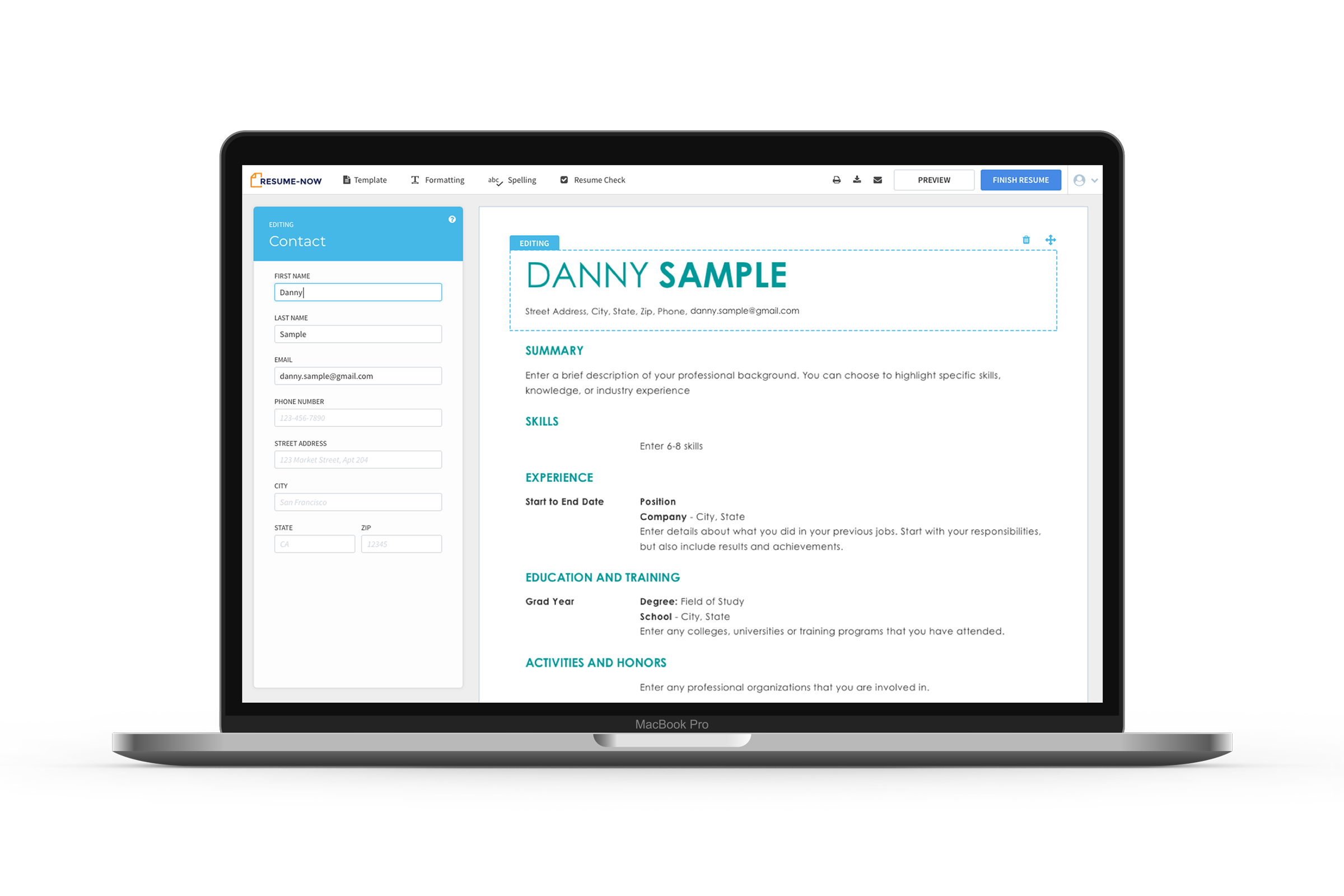
Users want to see live updates
One of our biggest design implication was removing the modal that covered in the center of the screen and instead created a side panel when user could input personal information. This allowed user to see how their resume looked at a glance. The participants throughout user testing expressed delight when seeing their resume update in real time. It helped create an immediate personal connection when they see their information appear on the resume in real time.

Users want control
Through testing we found that users appreciated us trying to providing content for them, but they wanted control over what goes onto their resume. There was a much longer cognitive load when users were trying to understand what the system had automated, and at the end of it, they still added and edited their own content.