
Resume Builder Redesign
The Project
Background
The resume builder experience had not been updated since the product’s inception in 2008, so after extensive quantitative research and a deeper look at the current product experience with users, we were challenged to redesign the resume builder experience.
My Role
I was the UX / Product designer working closely with product management, engineering, analytics, and research to develop test-ready prototypes based on research, iterate on feedback and deliver visual designs with interaction specifications.
Deliverables
5 Usertesting sessions
Working Prototype
Wireframes
Interaction Specifications Doc.
Timeline
Within 10 weeks, we launched a new resume builder experience that received 15 million visitors the first month.
Business GOALS
Increase subscription conversions and increase engagement in example content (TTC).
Research Insights
Prior to this project, our research team conducted an in-depth study into the current state of the resume builder. The study revealed great insights that influenced design decisions through the design process. These are some of the key insights:
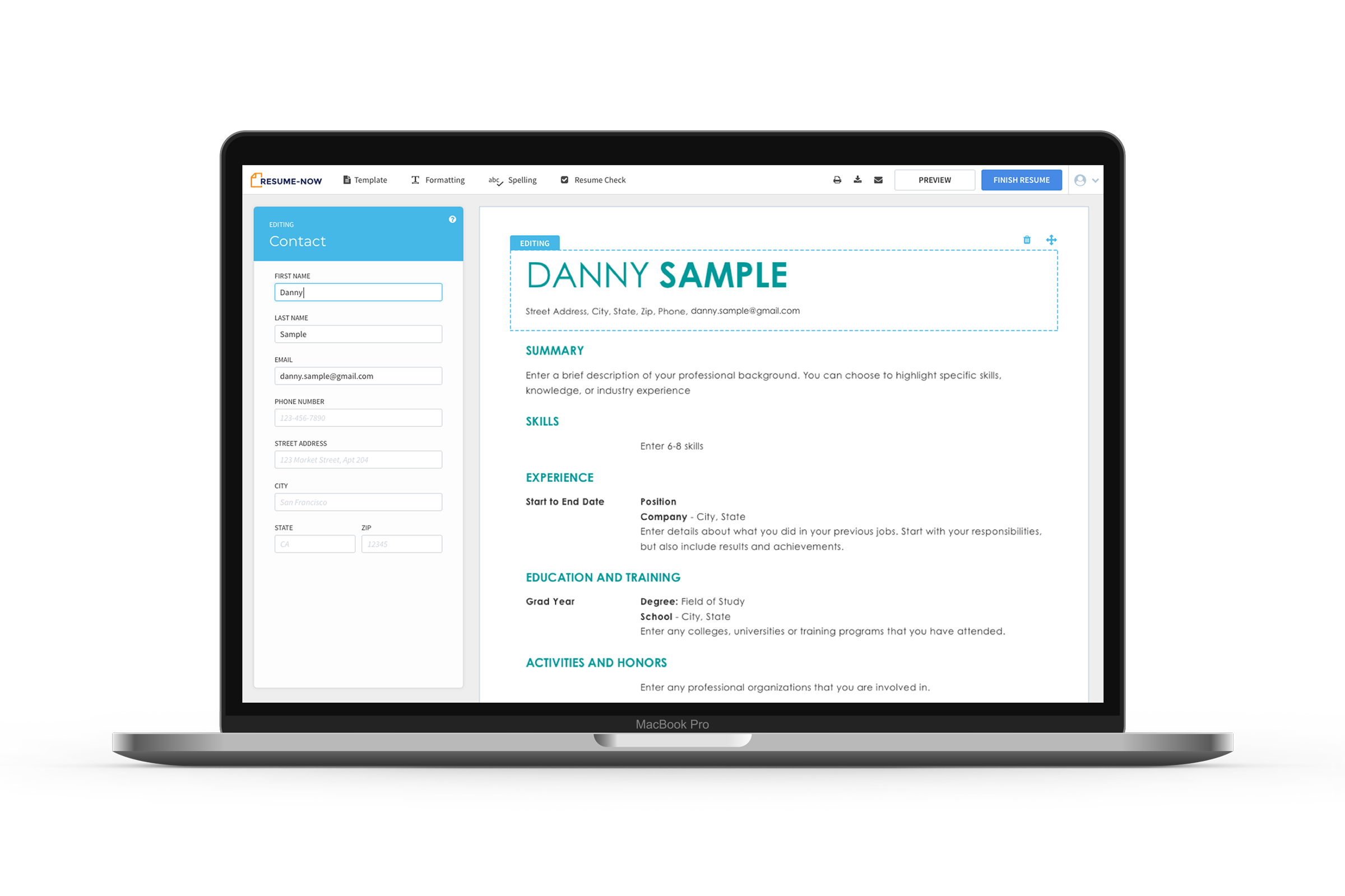
The modal interface distracts from a simple and effective interface.
Users want to know how their information gets formatted.
Example content (TTC) gets overwhelming and difficult to browse and relevant content.
Data Insight
85% of our users that buy a subscription, use example content (TTC) in their resume.
Current Experience

Ideation & Prototyping
How might we engage users with relevant example content to help them write better resumes?
Design Goals
Remove the modal interaction pattern.
Explore ways to highlight example content to increase engagement and relevance.
Constraints
Keep all the existing functionality and no inline builders like WORD or Google Docs.
How did we get there?
Conducting 5 unmoderated testing sessions with 56 total participants.
I wanted to make sure the team had a voice when designing and testing concepts so I would do a weekly review to share progress and capture any feedback, and issues that may arise.
Prototype Testing
VALIDATING MY CONCEPTS
I got early feedback on wireframes concepts to get the go-ahead from stakeholders before moving into prototyping. I then took the wireframes and created a series of prototypes to do counterbalanced comparative testing.
Check out one of the prototypes I created and tested. Because we tested targeted flows I only made the interactions work for the Header and Work Experience sections of the resume.
Test Session 1
Side PAnel Builder VS. Stacked Builder
What we wanted to learn
How do participants expect to navigate resume sections?
Do participants prefer the side panel or stacked builder?
What we learned
Participants liked seeing updates on the resume in real-time.
Participants want control.
Test Session 2
Existing TTC VS. FILL IN THE BLANK
Test Session 3
BUILD IT FOR ME VS. START WITH EXAMPLES
What we learned
Participants want browse functionality for example content.
Fill in the blank was helpful when you don’t know what to say or how to start.
Selecting individual sentences has a more clear expectation of what will happen next.
What did we want to learn?
Can participants discover and use the TTC?
How much help do users want writing a description?
What do participants expect to happen at each step?
Test Session 4
BUILD IT FOR ME VS. FILTER CONTENT
What we wanted to learn
Does filtering examples help participants find relevant TTC?
Do participants want to use individual examples or have the system build complete descriptions for them?
How much of the resume do users need to see when editing their content?
What we learned
Participants felt ‘Build it for me’ was simple once they understood how it worked.
Participants felt ‘Keyword Filter’ was more straightforward and better met their expectations of what happens next.
Test Session 5
RESUME NAVIGATION VS. SIDEBAR NAVIGATION
What we wanted to learn
How do participants navigate through different sections of their resumes?
Can users discover where to format and change the design of their resume?
What we learned
10 of 10 participants that saw Resume Navigation, navigated using the resume.
No participants used the side navigation, they noticed if after interacting with the resume.
Automation was too much for some users and in some cases added more work.
Usertesting Session
I went through numerous rounds of testing to help understand what level of help users prefer when building their resumes. This is a clip from one testing session in which the participant had an “Aha!“ moment when they understood what the system has done for them. While the user expresses delight in the help, they elaborate on how they would still want control over the content getting added to their resume.
Key takeaways
Users…
Like seeing their resume update in real-time.
Appreciate the help, but want control.
Adding motion delighted users
Found using example content more efficient and higher quality.
Found sorting example content helpful.
Instinctually navigate using the resume.
Impact on design
Move modal contents into the side panel, and show users their progress in real-time.
Use motion to highlight example content, and show it when a user is writing a description.
Final Design
Design Implications for MVP
Not every concept we tested improved the experience, in fact, users felt the system was doing too much and created more work if the users didn’t agree with the automation. So I took the ideas that users found helpful and created a hybrid design.


Retrospective
This project uncovered a lot of opportunities to provide help to our users with example content. I believe had we done moderated tests and more stress testing with the final designs to ensure an optimal experience.