
Recruitment Tool ReDesign
Initial Research
Our research team conducted a series of surveys to establish a deeper understanding of the recruiting process and where recruiters struggle the most in their day to day tasks.
This helped us to:
Gather an understanding of our user and their needs.
Learn about the current state of the product and what are the touchpoints to the user.
Understand the pain points for recruiters in the hiring process.

The biggest pain points recruiters face in their job is:
Wasting time going through unqualified candidates
Finding efficient ways to manage candidates
Knowing where to post open positions.
Team Ideation Workshop
Members from our Design, Research, Product, and Marketing teams came together in a three day workshop to better understand our users and start to build an archetypes. This would later help us understand where in the a recruiters journey can the features in our product provide the most value.


Takeaways from the workshop
an archetype was created

Dorothy
Dorothy is the one-person HR department for a group of 4 dental clinics in 3 cities. The group has a total of 65 employees, and she fills 15 jobs a year, so she is constantly pulled in multiple directions at once. She needs a helper, but the clinic can’t afford one.
Key tasks: Payroll, benefits, compliance, recruiting, onboarding, timesheets, HR paperwork
Career background: HR manager for 6 years, previously office manager
Tech knowledge: Low
Frequency of use: A few times a week
Education: BA in English lit
We also developed Dorothy’s Recruiting journey
and, a Set of GOALS that the product would try and solve
Reduce the time it takes recruiters to source and manage candidates
Improve the quality of candidates she receives
The Projects
Now that we had goals for the product that we know would help relieve the pain points of Dorothy, we needed to build out the features that would accomplish this. To figure out what features to build we started with a question. These questions would help guide the project.
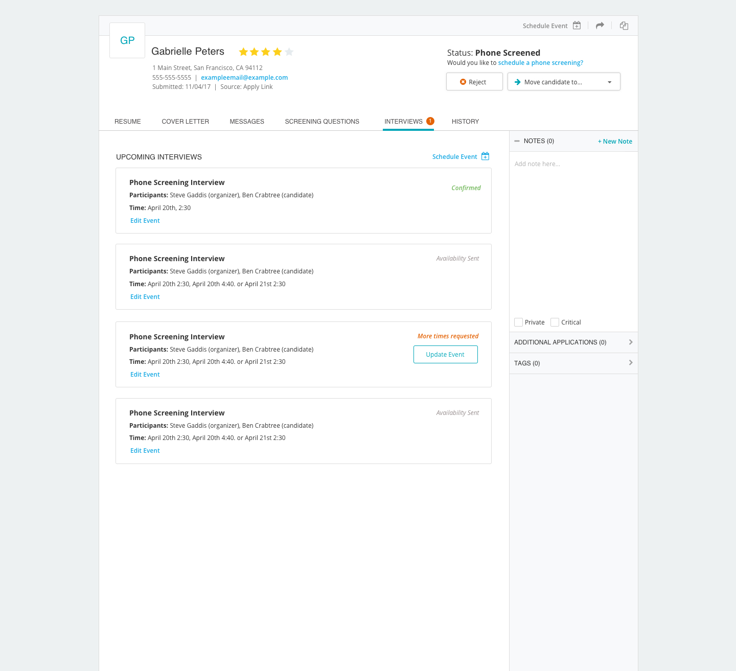
Candidate Management Project
Question:
How might we make candidate management more efficient?
Solution:
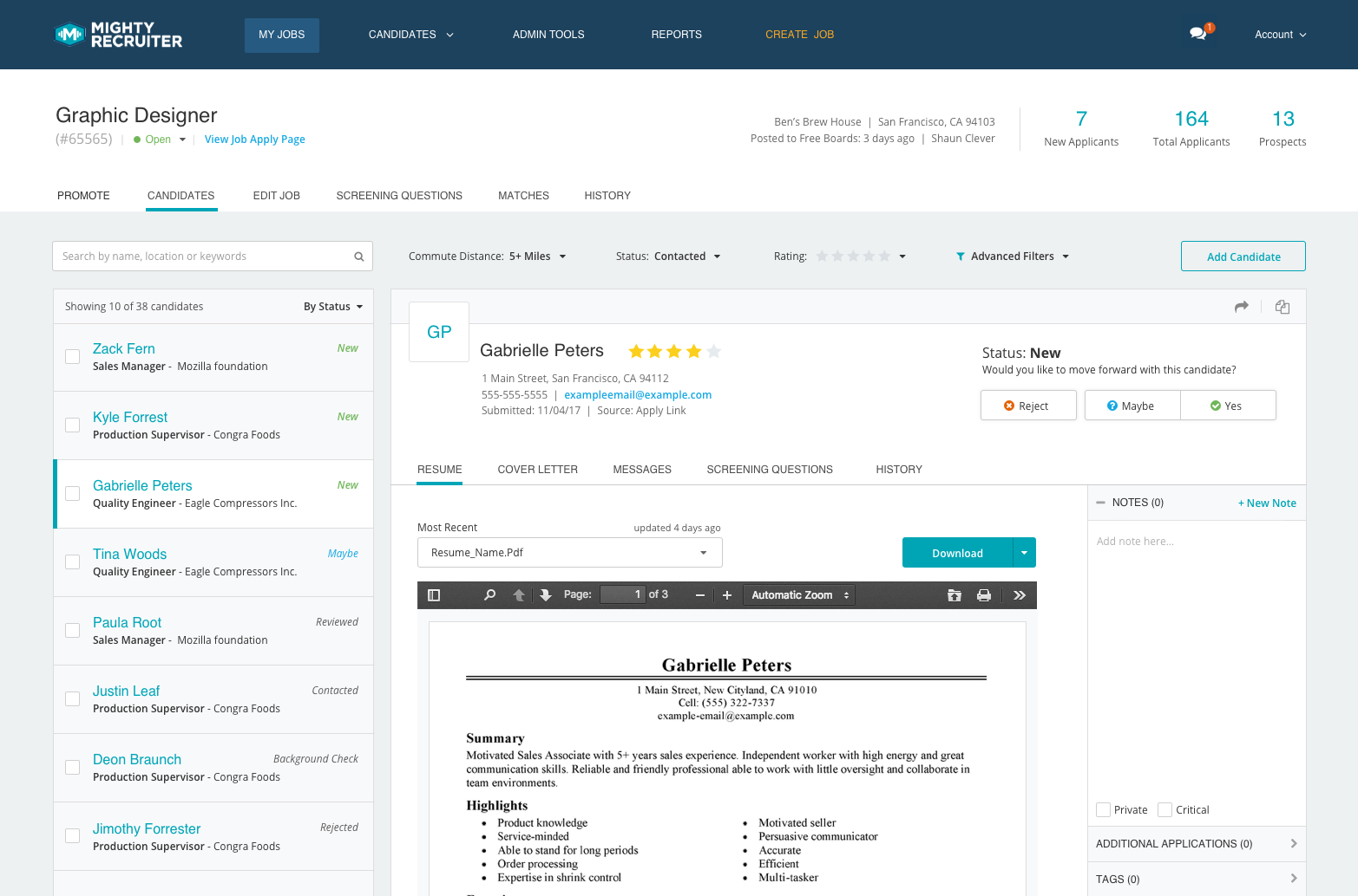
Create a UI that allows recruiters to quickly scan for the information they need to pass or reject a candidate.
Competitive Landscape
First we wanted to look at how our competitors as well as non competitors handle information for things such as personal profiles, job applicants, job postings, housing lists, and e-commerce sales. It was important to understand how they displayed information, and what happened when you interacted with it, to help us see the pros and cons of each UI and interaction modal.
Brainstorm Session
Next step was setup a brainstorm session with just a few of the key stakeholders to define the problem we are trying to solve and help create a hierarchy for what is important for this design.
Sketching to Wireframing
I then took the feedback from the brainstorm and started to sketch out potential solutions that I would run by a few colleagues to make sure some of these concepts make sense, and to make sure it is solving the problem.
The goal of the design was to:
allow recruiters to quickly see the information they needed to pass or reject a candidate without reading a resume.
allows recruiters to search, rate and filter candidates to improve candidate quality.
show recruiters valuable information that will help them manage open job requisitions.


Review and Sanity Check
After creating numerous iterations to the wireframe we agreed on a design that looked promising. We did a review with stakeholders to make sure everyone agreed with our vision and to give anymore feedback before we tested the design.
Feedback
Too many clicks to move a candidate to the next phase.
We cannot parce certain information from a resume with 100% accuracy.
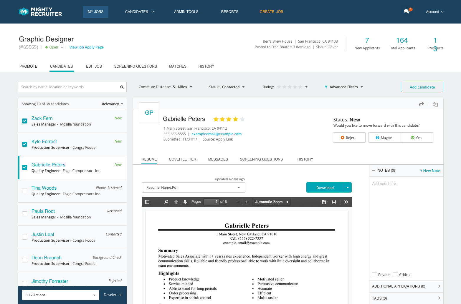
There needs to be bulk actions on candidates.
Candidate “Status” is not prominent enough.
Notes takes up too much important space on the page.

Prototype
Once a wireframe was approved I created a basic click through prototype to test the understanding and usability of the design. Once that prototype ran through basic usability testing, we decided to move to a higher fidelity, and a more interactive prototype, which you can play with below. Because we were testing specific tasks, not all action work on the prototype.
Testing
We took the prototype to our internal recruiters to run some in-person testing and ask questions to make sure the design was solving their problems. While we did not get a large sample size, the feedback we received was very positive. They responded positively to the architecture of the UI, and the ease of moving candidates through each stage of the hiring process.
Visual Design
Due to a rushed deadline we were not able to run follow-up testing, so my prototype got passed off to our visual designer to finalize the UI styles while I put together interaction specifications for our development team in India.

Interaction Guide
When testing was finished and I nailed down the interactions and how I wanted them to work. I wrote out a guide to go along with designs, this was made as a guide for engineers to reference. Because there was a 12 hours difference with our engineering team, this would eliminate a lot of back and forth for basic inquiries.
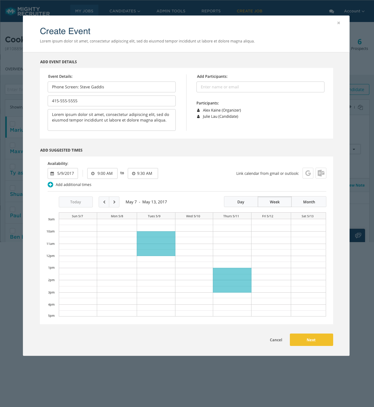
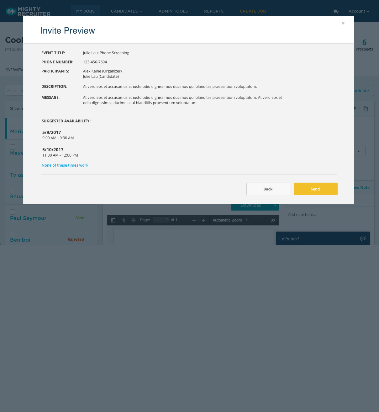
Scheduling Events Project
Question:
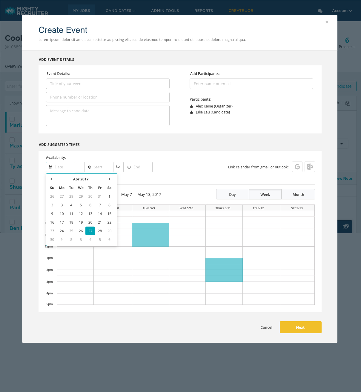
How might we make scheduling interviews with candidates more efficient?
solution:
Design a scheduling UI that allows recruiters to schedule and manage phone and in-person interviews with applicants.
Competitive Landscape
We started off by looking at calendaring applications to get a baseline for what our feature should have. We look closely at companies that do this particularly well, such as google, Calendly, Mac Calendar, and many others. Paying close attention to the different users and how they would interact with the UI.
Brainstorm Session
To get my ideas together I got a small group together again to review and define the goal of the project.
Sketches to Wireframes
I gathered everyone’s input and started to sketch some ideas. I then turned them into some wireframes to further narrow down the concept and gets my ideas worked out.
Prototype
To get quick feedback on the initial flow we created a click-through prototype to ensure that users would understand the flow and tasks at hand.
Testing
We ran basic testing through usertesting.com and internal participants so that we could validate that our design was clear and usable. Because of a lack of time, we were not able to run concept testing and try new and innovative ways to improve this feature. So we did the best we could to make sure that our baseline modal would satisfy the users’ goals and make their tasks easier.
Visual Design
After the basic interaction was figured out, as well as all the connecting api’s that would be needed to complete this feature from a tech perspective, we were ready to add some colors and bring my designs to life.
Interaction Guide
When testing was finished and I nailed down the interactions and how I wanted them to work. So I wrote out a guide to go along with designs, this was made as a guide for engineers to reference. Because there was a 12 hours difference with our engineering team, this would eliminate a lot of back and forth for basic inquiries.
Dashboard Project
Question:
How might we create a dashboard that helps recruiters complete their tasks efficiently?
Solution:
Design a space that surfaces the information recruiters need at a glance, as well as take action on items that need attention.
Competitive Landscape
Looking at dashboards is always a challenge because dashboards have been designed in so many different ways for so many different purposes. For this task, I knew we did not want to overwhelm the user so we had to start looking at what we could bucket or hide to create less clutter. At this point, we also knew we had to prioritize what information Dorothy would find valuable on a dashboard.
Brainstorm Session
I grabbed a few colleagues and wanted to get opinions on what makes a successful dashboard and define what Dorothy would need in this space to help save time.
From this conversation, we created a draft priority list to get an idea of the architecture of the page.
Recruiters want to:
see the jobs they posted
see how their jobs are performing
see what they have scheduled
complete their profile setup
Sketches to Wireframes
As usual, I took everyone’s feedback and notes and started to put some ideas together on the layout of the page. This gave me a sense of the hierarchy of the page and what would take prominence. Because we wanted to make recruiting tasks more efficient we wanted to make sure the first thing a recruiter saw on the page, was the thing they needed to see first.
We felt that completing their profile setup was vital to their success, so we placed that in the top left to ensure they would see it first.
Next recruiters would want to pick up where they left off so we placed ‘Last viewed Candidate’ to the top right. This would allow recruiters to save time searching for the last candidate they reviewed.
The next value piece was the ability to see all open requisitions and how they're are performing by showing the number of new candidates to the total pool of candidates.
To the right of job performance, I placed the agenda so recruiters could see what upcoming interviews they have for the day/week/month.
Notifications were the last piece that added value. There are lots of instances of notifications and it can be valuable to see them at a glance.

Review and Sanity Check
I ran a quick review to gather feedback on the first wireframe. Overall the design was received positively, but there was feedback that needed to be addressed.
Some recruiters may never finish completing their Profile, will it be there every time they log in?
Most recruiters don’t need to see ‘Last Viewed Candidates’, they would prefer to start on their last search query with a list of candidates.
Notifications are redundant at the top and the bottom. If they’re important they should be more prominent.
I took that feedback and made a few edits to simplify the design.

Improvements
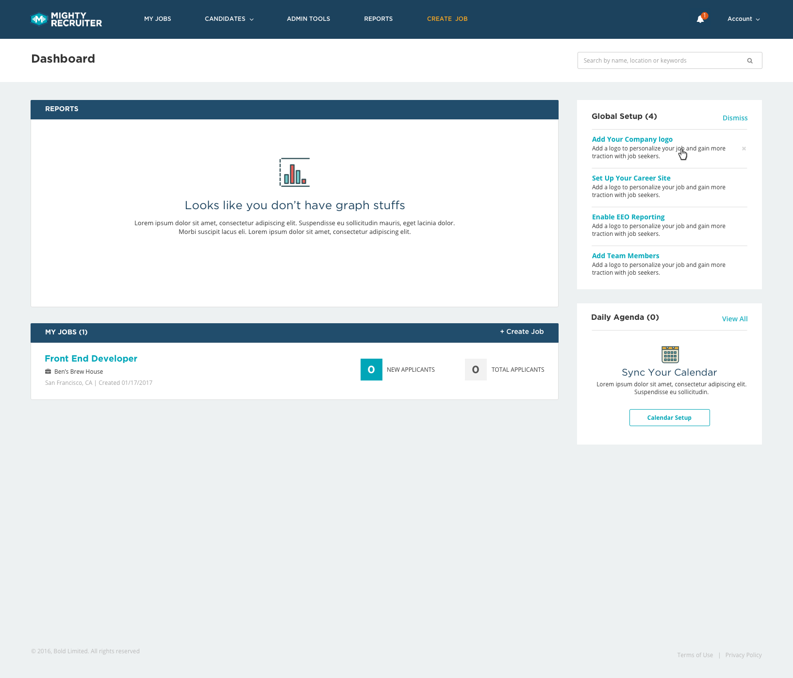
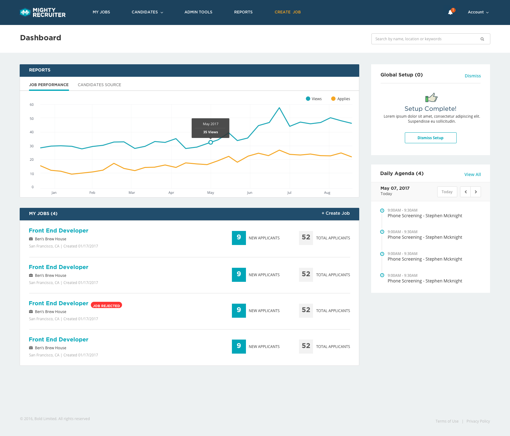
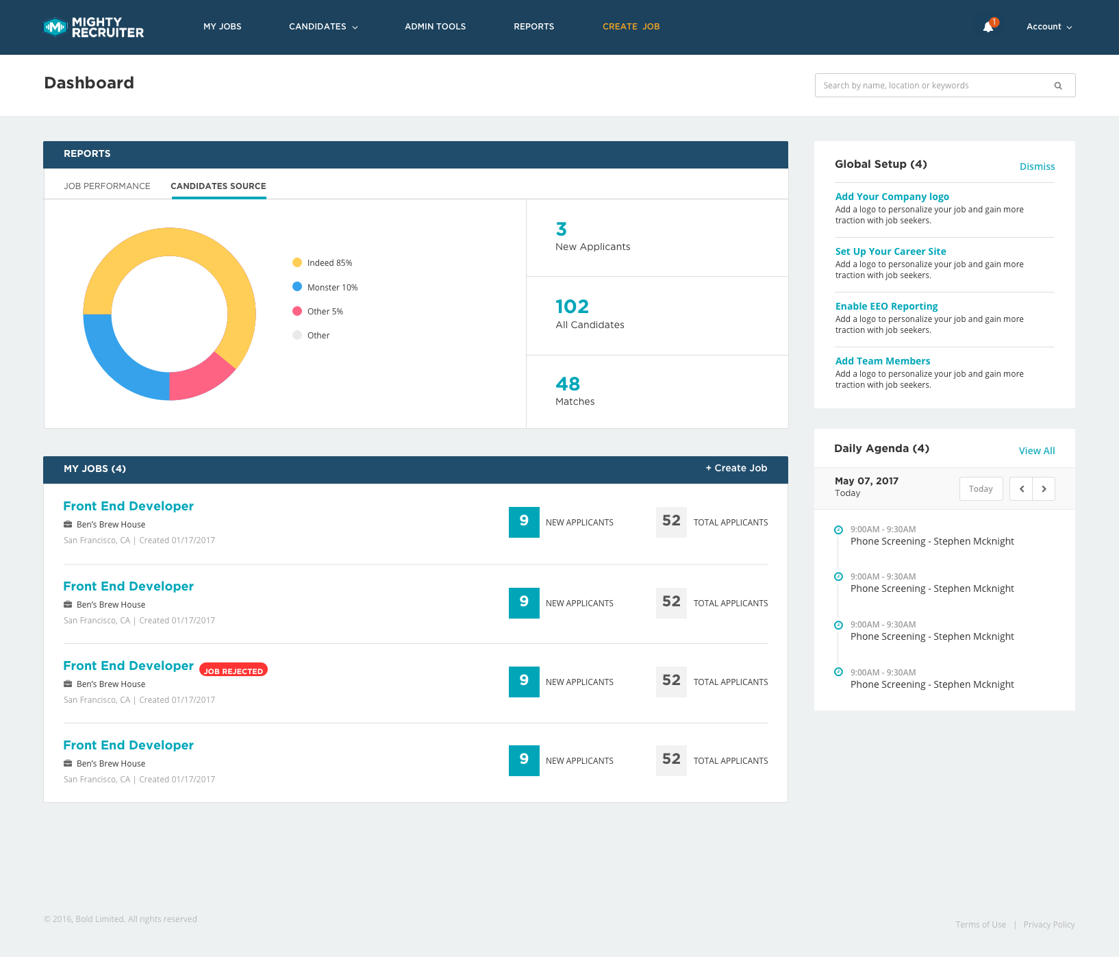
I moved the setup widget to the right and brought the jobs performance and job requisitions higher on the page. We found that recruiters care most about their job requisitions and because they’re more likely to have more than one, they need to be able to see how they are performing from a high level, but also be able to drill down into the details of that requisition. I simplified my design to only have 5 elements on the page:
Job Performance
My Jobs ( Job Requisitions)
Global Search
Global Setup (Profile Setup)
Daily Agenda
Testing
I ran a quick usability study to make sure users understood what they were supposed to do, and what they expected to do next. For lack of time we were only able to run one with 8 participants, take that minimal feedback and go into visual designs.
Visual Designs
The Final Product
After multiple reviews and iterations on each project, we delivered a beautiful set of visual designs alongside interaction specification guides and prototypes for our engineering team. We met weekly(if needed) to discuss any concerns or restraints they faced. When all was said and done, this was the product redesign that launched.
Project Retrospective
These projects were an uphill battle from the start. The company was slowly adopting user-centered design and that came with it’s own set of challenges. The idea of doing early prototyping and testing took too long, so through many of the projects we were limited to 1 or 2 rounds of testing, so it was hard to validate every idea and concept we had. I did my best to get all of my designs in front of people to help flush out my ideas and get some confidence that we were solving the problem at hand. While the product redesign launched and performed well, having more time to run testing with real recruiters early on would have led to an even more efficient and comprehensive interaction.